
Island of Rota: Fern One, 2009

Island of Rota: Fern Two, 2009

Island of Rota: Fern Three, 2009
Island of Rota: Fern Four, 2009

Island of Rota: Fern Five, 2009

Island of Rota: Fern Six, 2009

Island of Rota: Fern Seven, 2009

Island of Rota: Fern Eight, 2009

Island of Rota: Fern Nine, 2009

Island of Rota: Fern Ten, 2009

Island of Rota: Fern Eleven, 2009

Island of Rota: Fern Twelve, 2009

Island of Rota: Fern Thirteen, 2009

Island of Rota: Fern Fourteen, 2009

Island of Rota: Fern Fifteen, 2009

Island of Rota: Fern Sixteen, 2009
The Island of Rota
Translated from French, ‘cliché-verre’ means glass picture. The 19th century French painters Corot, Millet, Daubigny and others, used this method of making pictures, which involves creating a hand made negative. These artists took pieces of flat glass, smoked them with a lit candle, and drew images in the soot-covered surface with a sharp pointed instrument. Then they would place the glass over a sheet of photographic paper and expose it to light. When light passes through the clear parts of the glass that is scratched, it produces a line drawing in black on a white background. Contact prints made from these negatives have a wonderful sense of belonging to the realms of both drawing and photography.
I made this body of cliche-verres about ferns and cycads for a limited edition publication for The Museum of Modern Art organized by May Castleberry, editor of Contemporary Editions for the Library Council of The Museum of Modern Art, featuring the writing of Oliver Sacks and the design of Ted Muehling. The book entitled “The Island of Rota” was published in the fall of 2010. Read more about this book here, and see pictures of it here.

Cliché-Verre, Reticulated Ink, 2006

Cliché Verre, Patterns, 2007

North America- Cliche Verre With Ink Transferred to 8” x 10” Film, 2007

South America- Cliche Verre With Ink Transferred to 8” x 10” Film, 2007

Typhoon, 2009

Cliché-Verre, Imaginary Picture, End of Time #1, 2018

Cliché-Verre, Imaginary Picture, Landscape #1, 2018

Cliché-Verre, Imaginary Picture, Landscape #2, 2018

Cliché-Verre, Imaginary Picture, Landscape #3, 2018
Cliché-Verre, Imaginary Picture, Landscape #4, 2018

Cliché-Verre, Imaginary Picture, Sky #1, 2018

Cliché-Verre, Imaginary Picture, Water #1, 2018

Horizontal Landscape- Black Ink on Glass Cliché-Verre, 2015

Cliché-Verre, Imaginary Picture, Water #2, 2018

Cliché-Verre, Vertical Landscape, Black Ink on Glass, 2015


Cliché Verre
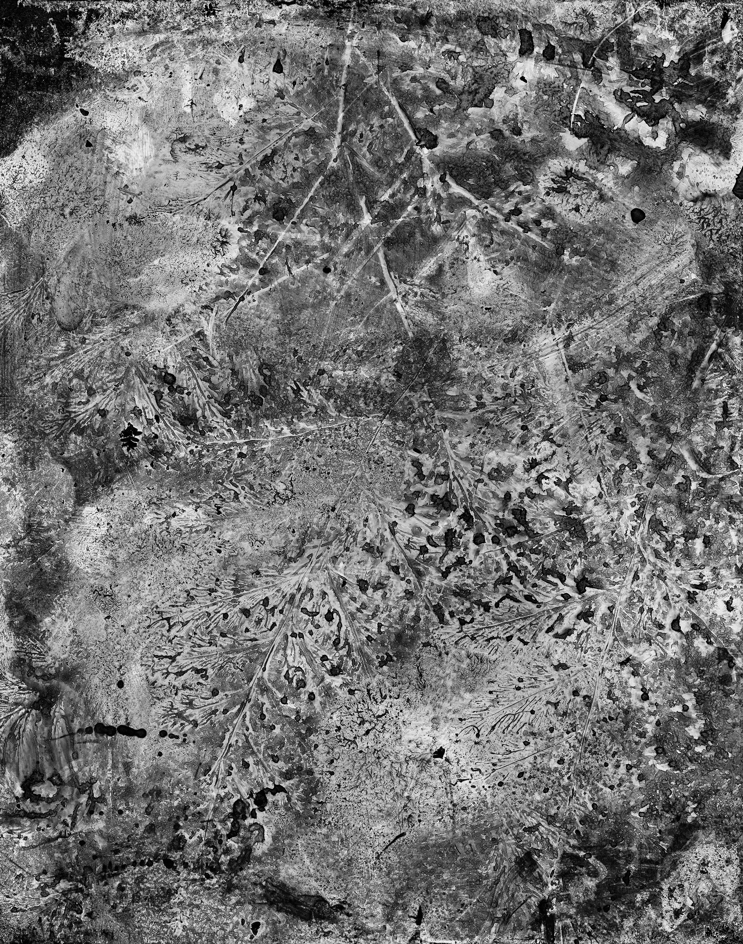
In my own cliche-verre work, I coat glass plates with several layers of ink to form interesting tonal densities. With ideas of creating a series of invented vegetative worlds, I pressed cuttings of ferns and cycads in half dried ink on glass plates. The finished negatives are then digitally scanned and printed. The images that I’m most happy with are the result of multiple pressings and repeated inking which, to my eye, border on chaos. Making cliche-verre images gives me a welcome opportunity to play with painting and drawing in the most rudimentary way; as a photographer, it’s nice to be able to get my hands dirty.
The relationship between photography and drawing goes back to photography’s birth. In 1833,Fox Talbot, frustrated by a clumsy drawing he made with a camera lucida in Lake Como, Italy, had the brilliant idea to “fix” an image he remembered seeing on the ground glass of a portable camera obscura he used in an earlier outing. Later, at home in England, that “fix” resulted in the invention of photography.

Fern#1, 2018

Fern#2, 2018

Fern#3, 2018

Fern#4, 2018

Fern#5, 2018


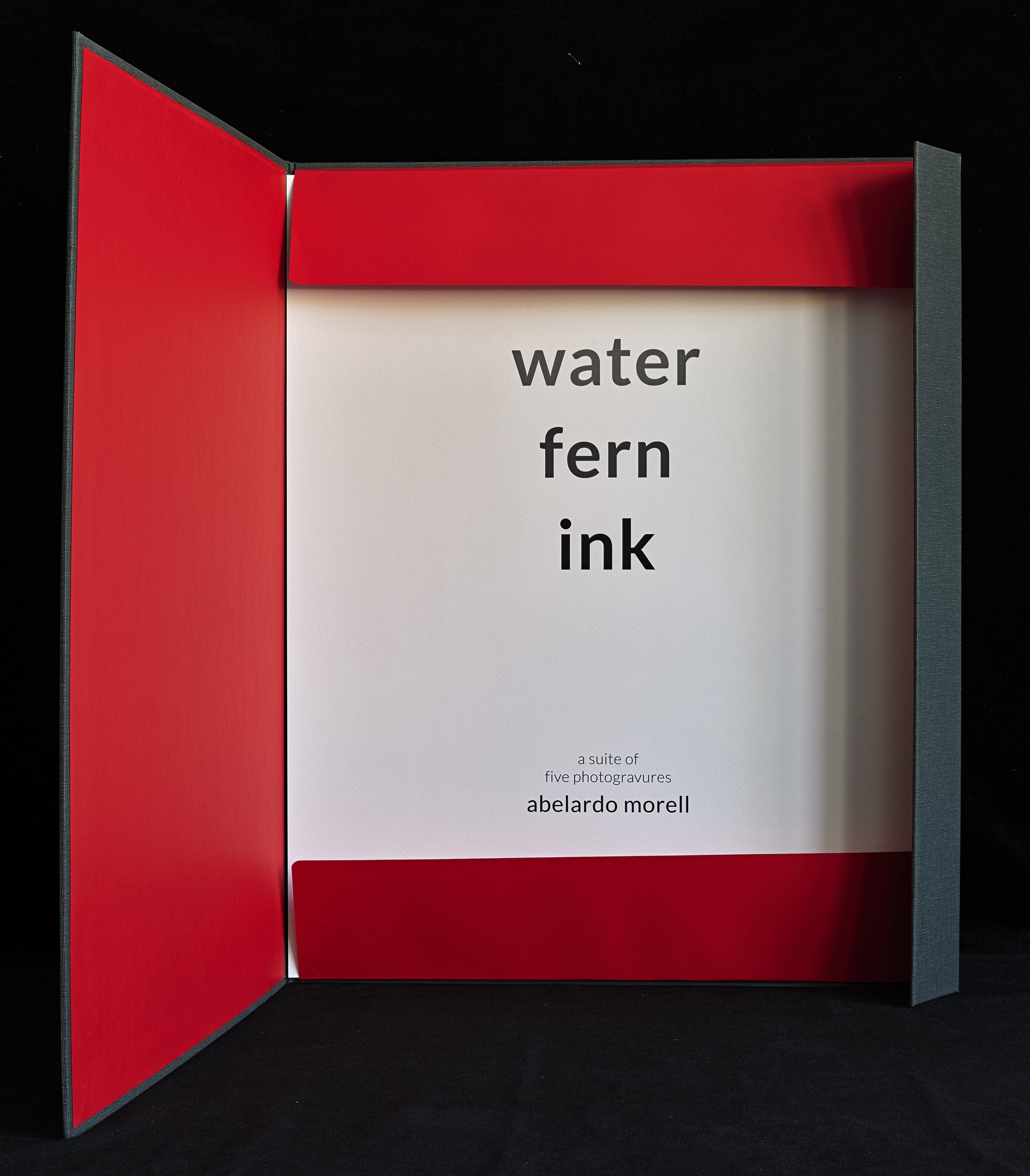
Water Fern Ink
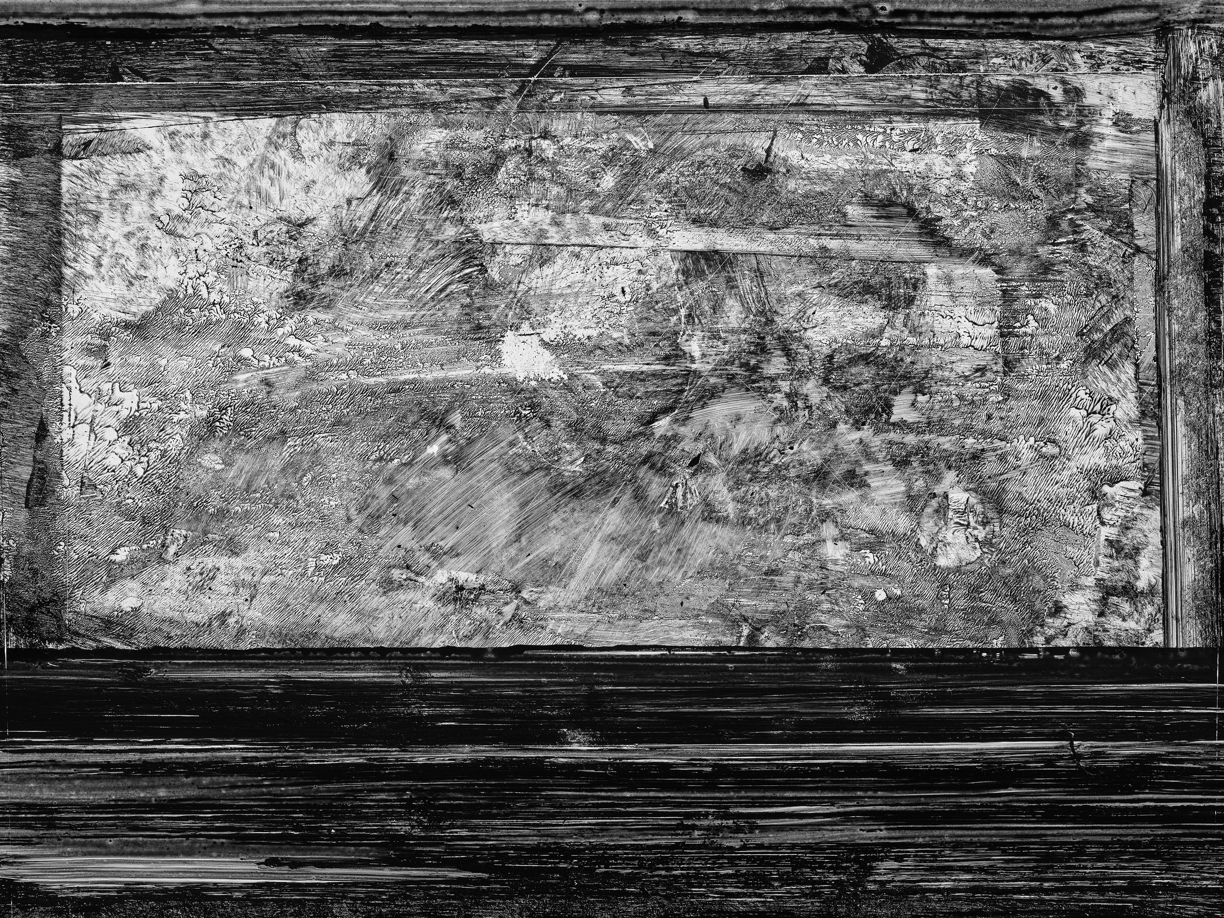
I love how ink looks when it meets paper. Beyond its role art, ink, in itself, is a phenomenal thing to take pleasure in. For this suite of fern images, I used two old ways to make pictures with ink - the cliché-verre technique for arriving at the images; and photogravure for the production of the prints.
Cliché-verre is a method of picture reproduction devised in 1839 by Fox Talbot- the English inventor of photography. Later in the 1850’s, the French artists Corot, Millet, Daubigny and others used cliché-verre. The artists applied dark ink or soot from a candle to blacken glass sheets, which when dry, allowed them to scratch drawings on the glass surface. The hand-drawn image on the glass plate was then sandwiched with photographic printing paper and exposed to light in the darkroom in order to come up with a photograph of the drawing. This hybrid art form combines printmaking and photography in a delightful and inventive way. In my process, I applied black ink onto glass plates in order to draw and paint my designs. I also pressed ferns onto the still-liquid ink. In some cases, when the ink was dry, I photographed the glass plates with actual ferns resting on top of the ink to suggest other vegetative dimensions. When satisfied with the result, I scanned the glass negatives to create digital files, which in turn could be converted to allow for etching the image onto a copper plate.
The second process used in these prints is photogravure. Photogravures are photographic images etched into copper and printed traditionally with ink. In seeking a unique way to make prints of invented imagery of ferns and water, I decided that photogravures provided the right partner to my cliché-verre pictures. Something about the way a copper etching holds and transfers ink to a beautiful paper makes for the perfect translation of an elegant process that begins in ink and ends with ink.
Edition Information
Edition of 50 portfolios and five Artist’s Proofs. These images are available exclusively as photogravures. The photogravure plates were made by Paul Taylor and hand printed by Erin Sternfels on Rives BFK at Renaissance Press in Ashuelot, NH. Each portfolio contains five photogravures. Each photogravure is signed and numbered by the artist.
Portfolio box:
19 3/4″ x 24 6/8″ | Paper size: 19 5/16″ x 24 5/16″ | Image size: 15″ x 20″


Magnifying Glass, Photogram on 8x10 Film, 2006

Waterglass, Photogram on 8x10 Film, 2006

Wine Glass, Photogram on 8x10 Film, 2006

Flashlight and Salt, Photogram on 8x10 Film, 2006

Still Life with Pears, 2006

Still Life with Wine Glass, 2006

Water and Ink, 2006

Eclipse, Photogram, Cut and Scratched Film, 2012

Lisa, Photogram of Water on Film, 2012

Microcosmos, Photogram of Water on Film, 2012

Triangle, Photogram, Salt and Water on Film, 2012
Fern Sixteen, 2009
Photograms
A photogram is a photographic image made without a camera. It involves placing things on the surface of a light sensitive material and then exposing them to light. Traditionally this process has been done using photographic paper.
I make my photograms using 8×10 film on which I place objects and substances like water and salt. In effect, I produce a hand made negative. This process makes it possible for me to enlarge the images and to get a “positive” view of what I arrange on the film. In some cases, I cut and scratch the film itself to suggest a variety of surfaces and volume. I do this to achieve a dimensional reality that I want these images to have, no matter how abstract they may be.
To me the excitement of this series lies in being able to work in ‘extra photographic’ ways using some of the techniques and syntax of printmaking and drawing. I love the concrete surfaces in these photograms.